Vantage — A Banking Website That Makes Wealth Feel Within Reach
(SCROLL)
Project
Overview
Making complex finance feel effortless.
Most banking and wealth platforms default to sterile dashboards and corporate blue, leaving users feeling like they're managing spreadsheets, not their future. Vantage needed to feel different: confident, modern, and a little bold, while still being trustworthy enough to hold someone's life savings. We anchored the design in a bold editorial layout, dark premium tones, and layered floating cards, turning routine banking actions like saving, investing, and tracking net worth into something that feels closer to a lifestyle product than a utility.
(DETAILS)
Type
Website Design
Category
Fintech / Digital Banking
Model
B2C
Engagement
Full Website
The Challenge
Banking websites tend to over-index on trust signals, badges, disclaimers, muted colors, at the cost of feeling alive or aspirational. Vantage needed to strike a different balance: feel premium and secure, without looking like every other fintech template. The goal was to help users feel in control of their wealth, not intimidated by it.
The Approach
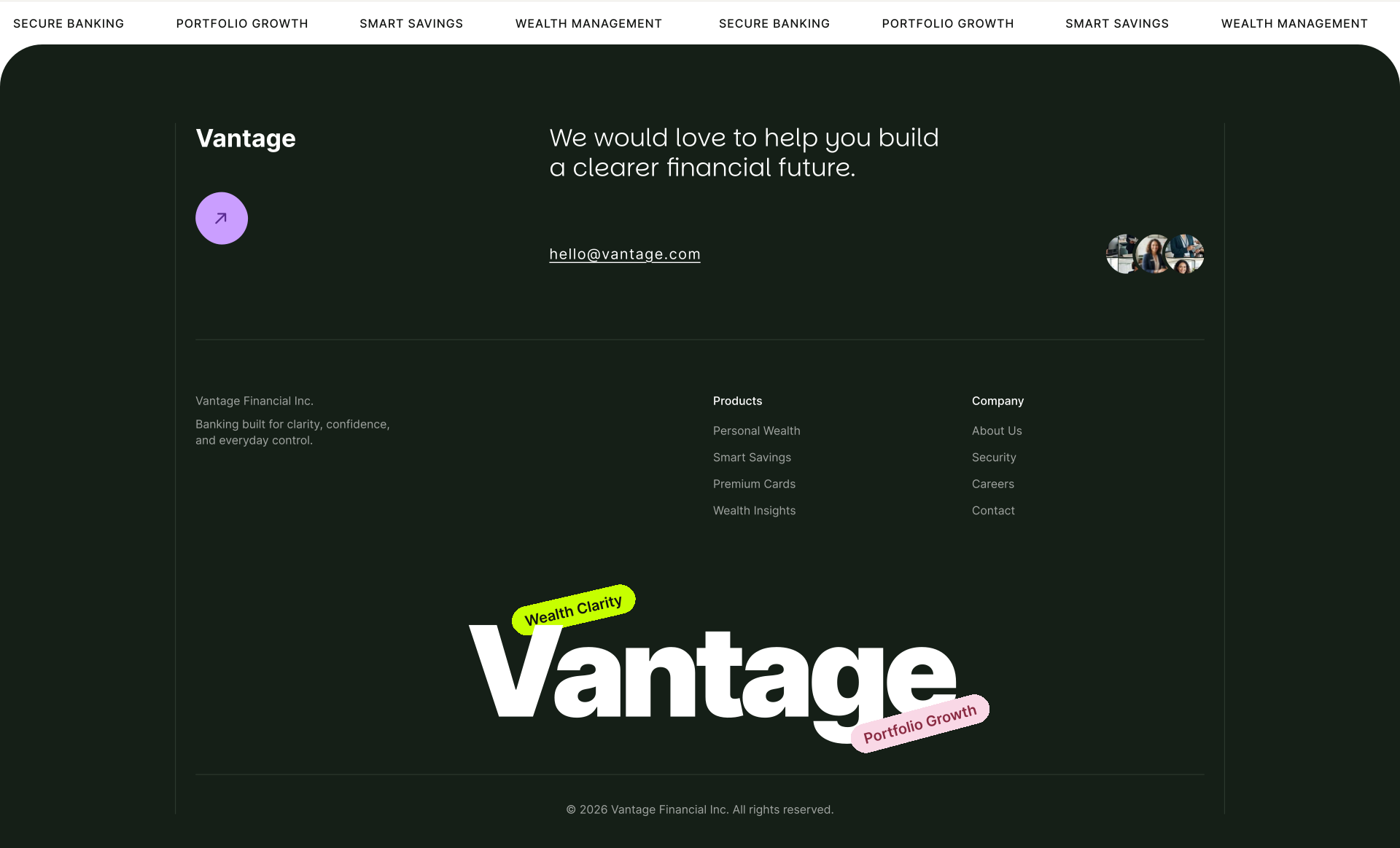
We built the experience around contrast, a deep, dark green base paired with a soft pink accent, letting bold typography and large numbers carry the confidence usually reserved for luxury brands. Instead of a static dashboard preview, we introduced the product through floating, layered cards (AI Insights, Secure Vault, Portfolio Growth) stacked at different depths, giving the hero a sense of motion and dimension before a single interaction happens.
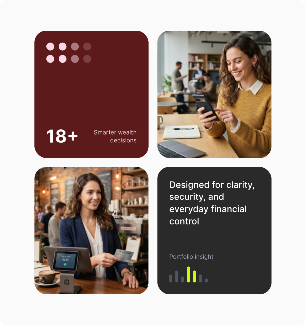
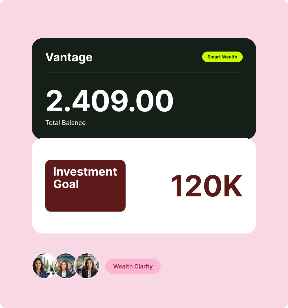
The result is a banking experience that doesn't just look premium, it makes users want to actually open the app and start building.